Stepping into Bootstrap
22 Feb 2024Intro
Before this class, I had very limited experience with HTML and CSS. Using them to create webpages has been a frustrating, but occasionally rewarding experience. HTML code can be an eyesore, as the amount of divs needed to create a nice webpage can be a bit overwhelming. Trying to find the spot where you left off sometimes feels like finding a needle in a haystack. For the past few weeks or so, we have been experimenting with using Bootstrap 5, a UI framework, for designing webpages. My hope was that Bootstrap would simplify the web design process. So far, I have mixed feelings for Bootstrap 5, as some features seem a bit redundant when CSS already exists, while features like the grid system makes laying out the webpage easier.
Limited Customization
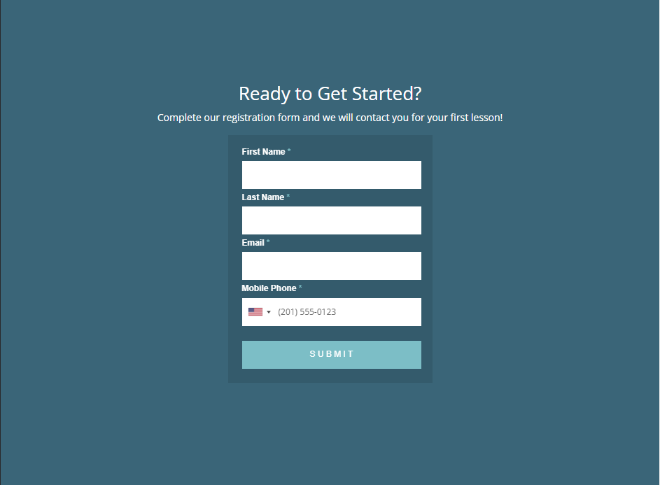
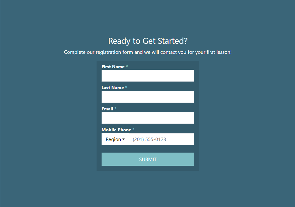
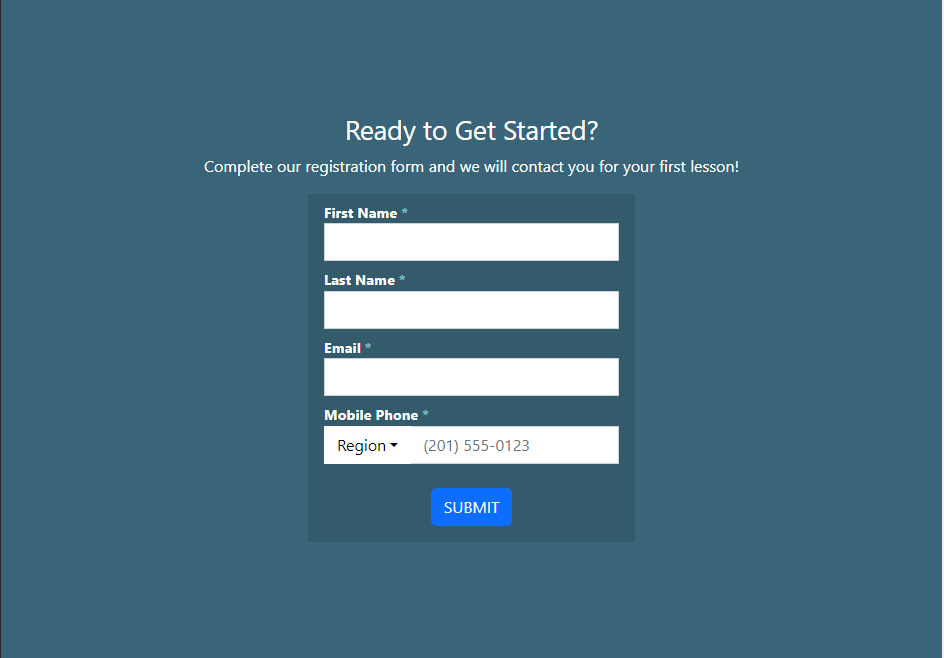
Below (from left to right) is the original webpage form, the form I ended up creating with CSS, and the form when using a Bootstrap button.


Notice how the Bootstrap button is a different size and color. I was using a default Bootstrap button class called btn-primary. I tried for hours to replicate the button using purely Bootstrap elements, but to no avail. I checked if any of the default Bootstrap buttons have a color similar to the one I needed, and to my surprise, there were only 8 colors, and none of them matched the color I needed. In order to use a Bootstrap button, to achieve the look that I want, I had to customize it with CSS, which made me question the point of using Bootstrap elements when replicating a website. I've come to the realization that Bootstrap is more suited for creating websites from scratch, as prebuilt elements could save the user plenty of time. But if you want to achieve a specific design, using Bootstrap alone feels limited.
So where does Bootstrap shine?
Where Bootstrap shines best is in the layout department. The most handy feature so far has been the grid system. Using row classes and col classes for divs made laying out the website more comprehensible. Placing elements directly next to each other is made easy using this system.

  <footer class="footer mt-auto py-3" id="bottomMenu">
  <div class="container">
    <div class="row">
      <div class="col">
        Lunch
        <hr/>
        Monday - Friday: 11:00am - 2:30pm<br/>
        Saturday - Sunday: Not open
      </div>
      <div class="col">
        Bar
        <hr/>
        Monday - Friday: From 11:00am to closing<br/>
        Saturday - Sunday: Not open
      </div>
      <div class="col">
        Dinner
        <hr/>
        Monday - Friday: 5:00pm - 9:00pm<br/>
        Saturday - Sunday: Not open
      </div>
    </div>
  </div>
  </footer>
The simple concept of columns being enclosed by rows makes it easy to visualize what is needed to format a multicolumn element.
While customization is still dominated by CSS, formatting the website is made easier with Bootstrap. Other features, like navbar, container-fluid, and many more make formatting easier. If I ever need to use Bootstrap again, I'm excited to see what other formatting tools I can use. While writing this essay, I've come to realize that any grievances that I had with Bootstrap are really HTML's fault. I learned that Bootstrap and possibly other UI frameworks can help with the clutter of plain HTML, so I welcome any framework that attempts to help.